The nicer weather that comes with spring and summer means more people will be outside hosting events and festivals. That means it is also time to start thinking about advertising these events with printed banners.
Hanging banners is a great way to get publicity for an event. They can be strategically placed in high traffic areas and are seen by both foot traffic and road traffic.
SignCenter produces banners every day. Every type of banner, from pole to over the street banners to banner flags– we have seen it all.
One thing that repeatedly happens is the need to go back to our customers over design issues. In order to alleviate any potential time issues and additional work for you or your customers, we put together this quick list of design tips.
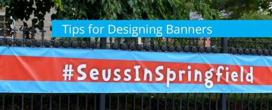
Tips for Designing Banners
- Colors: When choosing colors, consider the environment the banner will be hung in. Choose colors that will contrast with their surroundings for higher visibility.
- Message: Keep your message short and sweet. The event name, time and place are the most important pieces of information to convey.
- Fonts: Have fun with your fonts, but make sure they are legible and keep in mind a lot of viewers will be on the move while reading. Font size is an important consideration. Test your point size by printing out your smallest text at full size on a piece of paper. Tack the paper high on a wall and view it from different distances. If you struggle at all to read it, so will viewers and you should go bigger. A basic design rule is to multiply the letter height in inches by 10 and that is the ideal readable distance in feet. (Example: A 3” letter is best read at 30 feet or less, 4” at 40 ft or less, 5” at 50 ft or less, etc.)
- Image Size: Ideally you would like your images to be 300 dpi at full size for clean viewing. Since banners will be viewed at a distance, 60 – 100 dpi at full size is usually perfectly acceptable. Test your resolution by printing a section of an image at 100 percent. Tack the paper high on a wall and view it from different distances and decide if the image is clear enough.
- Safe Design Area: Don’t place any text or small images at the edges. A grommet punched through a picture of someone’s face or the text can ruin your banner’s design. Leave at least a one-inch space away from all edges for hems and grommets.
- Wind Slits or Mesh: Wind slits are often needed to keep large outdoor banners from turning into sails. If you think wind slits will ruin your design or messaging, consider printing on a mesh banner.
- Reinforcements: When thinking about the construction design of your banner, there are several configurations available to ensure your banner will look great and be secure. Consider ordering with webbing reinforced hems, d- rings in corners, rope sewn in hems, pole pockets, etc.
If you keep these tips in mind while designing banners we should never need to come back to you to change the artwork and your banners will always look top notch!
MAY
2018
About the Author:
SignCenter is a trusted wholesale printing source for materials that are beyond the day-to-day capabilities of many businesses in the printing and sign trade. SignCenter supplies top quality digital graphics and signs at wholesale prices.